BART Smart Environment Design
Overview
My objective was to design an app that assisted people with choosing their next home, whether that’s an apartment or house. Through extensive research, my team and I found the pain points and needs of our user base and designed a solution with these in mind.
Duration
3 weeks. Agile/scrum methodology
Tools
Figma, FigJam
Context
With the emergence of AI and many smart sensor capabilities, the goal was to apply these properties and capabilities to a public transportation system to vastly improve functionality.
My Role
UX/UI Design, Testing
The Team
Solo
Selecting a Public Transit System
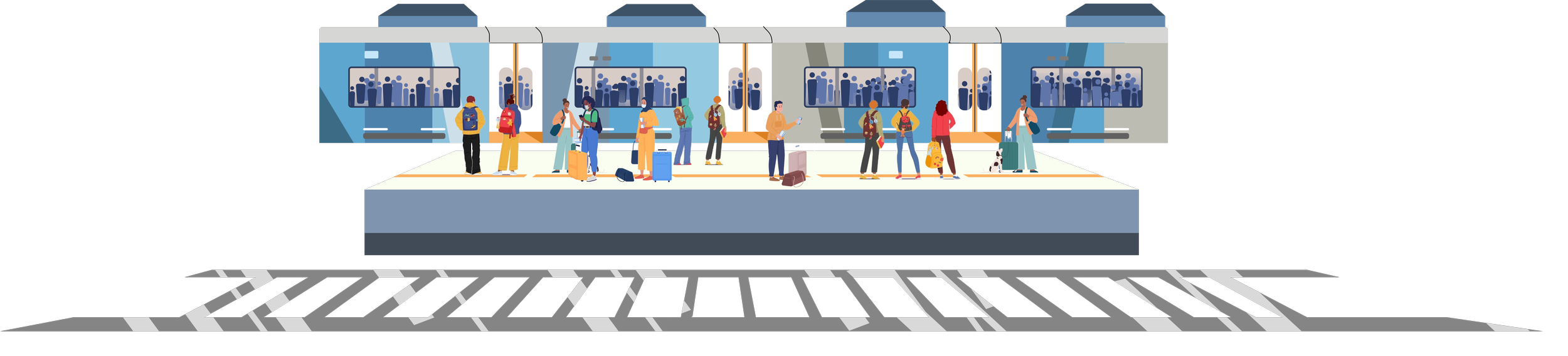
After brainstorming different public transit system, I chose to work with BART as it is an intricate transportation system that I use frequently and have personally experienced some short-comings.
Key Insights
Train Length Optimization
Train length can greatly impact efficiency in multiple ways - longer trains can hold more people, but will need a larger gap between trains, could take longer to start and slow down due to increased weight. Shorter trains may hold fewer people, but could come more frequently, travel faster, and require a smaller gap between trains.
BART Tech Updates
BART does not have the most up to date technology - this means a system update could drastically improve efficiency at all stations, especially during peak hours.
Decision-making Based off Key Insights
The smart environment would need to be able to register ridership counts in live time to help adjust the train schedules accordingly.
As such, using sensors in the BART stations as well as having in/out ridership live numbers through the paid gates would enhance ridership data.
There should be a way to alert the system for ridership influxes way ahead of schedule to plan all train routes accordingly.
Calendar syncing is an easy way to stay on top of new events, but could also merge with online news to stay on top of imminent events.
Certain stations/routes will need to be prioritized over others based on average ridership, but this will also depend on the time of year, weekday/weekends, and holidays.
Developing a Merged User Flow
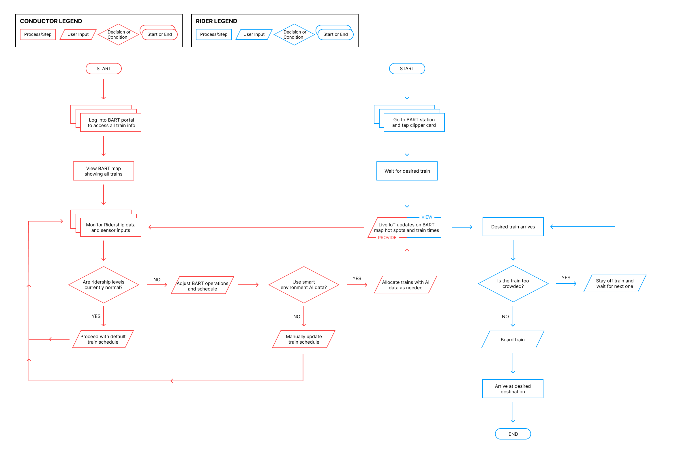
I felt it was necessary to show how the rider and conductor’s typical pathways would intersect. This would show how the system could satisfy both parties and stay in touch with both sides in live time.
Creating an Infographic

The infographic summarizes key details surrounding BART use, ridership, and ways to enhance efficiency and ridership quality.
Developing Wireframes

Home page: This screen is designed to show the entire BART map to both conductors, riders, and control center users. The navigation bar along the top allows users to view different information regarding the BART system.

Added Filter function: In the top right corner above the Daytime Service table is a filter icon. This icon is design to allow users to toggle specific details such as events, ride times, schedule, and other key information.

Calendar view: This page (navigated to through the Calendar tab up top) allows users to view the calendar of the year and filter/add events/ and toggle AI to see what dates will have ridership influxes, potential train schedule changes, and an AI feature to help suggest train routing for optimal ridership.


Active AI and Filtering: The blue and yellow dots show the BART map with filters applied to see what stations have certain events, and an overlay would show up while hovering each dot to show the reason, the time frame, and any suggestions for train scheduling.